Sunday, September 26, 2010

Downtown Presbyterian Church

              When my group discussed our feelings on the Egyptian architecture in the church, many different opinions arose.  Some people in my group were under the impression that for a place of worship (let alone Christian worship) to have any representation of a belief system that honored numerous gods was simply unacceptable and therefore not visually appealing.  Others in my group formed their opinions of the church's architecture completely separate from the building's purpose, and looked at it in a very non-objective way.  Personally, I chose to observe the church's architecture as a separate entity of its identity, and then critically question why a place of Christian worship would have been in favor of decorating its building in such a way.
               The architecture was most effective in transporting the visitor from downtown Nashville to a place across the Atlantic Ocean.  Certain techniques employed by the architect to achieve this visual effect were: showing large columns painted in perspective along the back wall, creating blue skies in the squares of the coffered ceiling, and including papyrus, lotus, and other river plants in the illustration of the stained glass windows.  The color palette was very specific to not only the time period that this style refers to, but the cultural origins that it stemmed from.  The main colors used in this design were: mustard yellow, greyish teal, bright blue, pink, and reddish browns.  The most occurring shapes in this building's design were triangles and trapezoids, which created a very geometric look.  Although curved lines were not typically found in the main structures built in ancient Egypt, they were sparingly included in the case of the illustration of Lotus or other flowers.

Friday, September 17, 2010

The Narmer Palette: Just as cool as the pyramids......


          Transitioning into talk about Egyptian culture and art this week, I was interested to learn about something in Egyptian art that was not just a part of the pyramids.  I have studied the pyramids in school before, and while I find them very interesting, I was hoping to talk about something just as important and similar in its historical meaning, but without hearing the same things I've heard before.  The Narmer Palette, therefore, intrigued me because it is a set of modest-sized carvings into green schist that conveys a very pertinent message from Egyptian history without being the size of a cruise ship.  The use of heiroglyphics spells out in pictures on the palette that upper and lower Egypt were to be united.  This was done by including the symbols papyrus and lotus flower, which represent lower and upper Egypt respectively.  
          These two palettes also explain much about the social classes at that time in Egypt.  By having the middle figure be the largest and placed in the compositional pose, he is designated as the character in this story with the most power.  This figure is meant to represent the king named Narmer who is shown with a fairly ambiguous face and no signs of his age at the time that the palette was completed.  This was custom in Egyptian art that portrayed powerful rulers because the Egyptians believed that a person would assume the identity they were portrayed with in carvings when they passed over into the afterlife.  

New Orleans artists react to BP Oil Spill


              As a fundraiser to benefit the victims of the oil spill on the Gulf coast, a contest was held to create a work of art that would best express the emotional response to the disaster.  All of the pieces were sold to raise money to cover the various expenses from the oil spill.  In total, the contest raised $23,000 with an overall winner selected from all the admissions.  Helen Stoilas covered this story in The Art Newspaper in Issue 216 on September 10, 2010.  The chosen winner of the contest was political cartoonist Steve Breen of the San Diego Union-Tribute who came up with the design shown above.  The thing that makes this painting unique is that the artist actually mixed oil collected from the shores of Pensecola Beach, FL to make the paint.  His described technique was to water it down slightly to make it more fluid to paint with.  I chose this article because it focused on the role that artists play during and after natural disasters. Within the article, director of New Orleans’ Prospect Biennial, Dan Cameron,  described the crucial role the city’s artists have played during the oil spill “volunteering as first responders, supporting organisations that advocate for sustainable gulf economies, and documenting the crisis as it unfolds”.  I feel like this is a way in which I have never viewed artists and their connection to history, but it makes their relationship more clear to me now.

http://www.theartnewspaper.com/articles/New-Orleans-artists-react-to-BP-oil-spill/21346

Friday, September 10, 2010

A picture says a thousand words.....so take this!


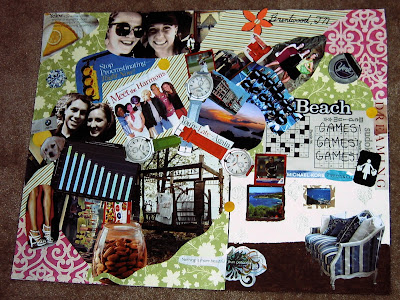
            The elements in my collage all represent very unique characteristics of me; many of which most people wouldn’t know.  I chose two pictures of professional women’s’ softball pitchers since that is the position I play for Belmont.  I also included two small pictures taken in the Virgin Islands because that is my favorite place to visit.  I included a page out of a sudoku puzzle book because I have become quite obsessive with working them.  The words reading, “You’re Late - Again!” are sadly very descriptive of me, although I am working on being more punctual.  I included the blue and white couch in the lower right corner because it reflects my extreme interest in interior design and decorating.  The “Meet the Harmons” square introduces you to my family, including my dogs Gomer and Floyd.  My geographic location is described by the striped state of Tennessee in the top, right corner of the collage with a flower that marks Brentwood.  To represent “the world today”, I chose a bar graph that illustrates how our country compares to others in health care spending because this is an area of study I hope to get into when I graduate.  I illustrated the importance of art to me by including two pictures of myself next to famous paintings from the Art Institute in Chicago, where I visited this past December.  The couch I included in the corner also represents my view of history and art and how they have worked together to shape me into the kind of person I am.  I have always been intrigued by furniture design and how it has evolved over the years, and the more I have learned about it, the more my tastes have broadened.
            A few conscious decisions I made in making this collage were to not use very many pictures of myself and use more pictures of friends and family, as well as activities that I’m interested in.  I also chose to keep the background color palette fairly soft so as to let my subjects stand out the most on the poster.  The colors I chose in particular for my collage were yellow, light green, light blue, and brown.  I chose yellow because it is my favorite color and I chose the rest of them because they complimented yellow and went well together.  The light areas of my collage were mostly in the background while the darker parts of my collage were the subjects.  To create visual texture, I used a striped paper in the background in several places of the collage and had the stripes facing different ways so as to create a sense of movement in the collage.  The volume of my objects were typically created by each item’s highlighting ad shading; such as the diamond and the jar of almonds.  The implied lines of my collage are the edge of the green paper that can be followed diagonally from the center of the collage to the top right corner, as well as the three watches in the center, which actually lead the viewer’s eye to three corners of my collage.  To create the illusion of space in my collage, I made the green paper curl around the jar of almonds.  I also anchored the couch on ground so that the viewer would feel like they were looking into an actual room.  The four symbols in my collage are: the yellow pie in the upper left corner, which describes my mood, the different clothing labels which stand for my love of shopping, the three watches which symbolize my past, present, and future, and the bed shown in the woods which emphasizes that I love being outdoors and I also highly value naps.  

Friday, September 3, 2010

The Bad, the Worse, and the Ugly: How "bad" art is making a splash in a world of refined tastes


Published in The New York Times, on September 2, 2010, Erik Piepenburg sheds some light on a few subjects that people may have preferred stay in the dark.  I'm speaking of the quirky, but well-respected realm of art referred to as "bad art".  Noted for not appearing to follow any rules of aesthetic beauty or balance, these worked of art are typically praised for just how horribly they were executed.  The man in the photo above, Judah Friedlander, is featured with his own work that depicts a Bigfoot holding onto a topless mermaid.  Friedlander says, "If a painting, whether it's at the Met or it's something that somebody threw away, gets a reaction out of me, gets me thinking, and gets me mentally and emotionally, I like it."  I think Piepenburg does a good job of presenting the material in this article without his own bias, although the people quoted in the article obviously approve of this so-called "bad" art.  I would define his thesis as stating that although we acknowledge that art has some understood rules of design that are typically involved in it, art can be just as impressive when those rules are broken as when they are followed.  He proves his thesis by using examples of art by Salvador Dali that many people find off-putting but also agree to be impressive art that has withstood the test of time.  This article related to what we have studied in class this week by basically considering an artist's conscious and unconscious decisions, and seeing what would happen if all the decisions were "unconscious" so to speak.  This appears to be the case in many examples of this "bad" art.

http://www.nytimes.com/2010/09/03/arts/design/03badart.html?_r=1&ref=designIf a painting," said Mr. Friedlander, "whether it’s at the Met or it’s something somebody threw away, gets a reaction out of me and gets me thinking, and gets me mentally and emotionally, I like it.”

Thursday, September 2, 2010

The Parthenon is "kind of a big deal".....or so it seems in class


               Of all the paintings we have discussed this week in class, the majority of them have been of the Parthenon. This particular one, however, has generated the most discussion.  Perhaps this was due to the unique placement of all the objects in this painting, not only including the Parthenon but also the structures around it.  The placement of the objects in this painting other than the Parthenon are considered part of an artist's conscious decisions when planning a painting.  Another example of a conscious decision in this painting is the placement and intensity of the light source.  If the light source in this painting was not shining directly on the Parthenon, it would completely change the mood and the message of the painting.  Also by having the light source shine directly on the Parthenon, it serves as a sign to the viewer that this is where their attention should be directed.
               The artist who did this painting was named Frederic Edwin Church, and he painted it in 1871 with oil paints.  The fact that this painting was done in oils gives the viewer a much better idea as to when it was completed.  Church actually attended the Hudson River School of Painting before he painted this painting.  It was obvious that Church had had some schooling because of his good execution of the medium.  It is also worth noting that there is a small figure standing in the foreground of a painting. This could easily be a symbol for the magnificence of the Parthenon compared to that of humans.  Along with the many conscious decisions Church made about this painting, he also made a few unconscious decisions such as choosing a fairly tranquil color palette except for in the areas of the shadowed part of the painting.