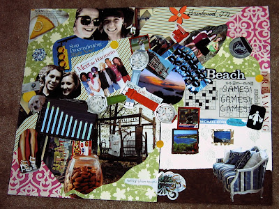
The elements in my collage all represent very unique characteristics of me; many of which most people wouldn’t know. I chose two pictures of professional women’s’ softball pitchers since that is the position I play for Belmont. I also included two small pictures taken in the Virgin Islands because that is my favorite place to visit. I included a page out of a sudoku puzzle book because I have become quite obsessive with working them. The words reading, “You’re Late - Again!” are sadly very descriptive of me, although I am working on being more punctual. I included the blue and white couch in the lower right corner because it reflects my extreme interest in interior design and decorating. The “Meet the Harmons” square introduces you to my family, including my dogs Gomer and Floyd. My geographic location is described by the striped state of Tennessee in the top, right corner of the collage with a flower that marks Brentwood. To represent “the world today”, I chose a bar graph that illustrates how our country compares to others in health care spending because this is an area of study I hope to get into when I graduate. I illustrated the importance of art to me by including two pictures of myself next to famous paintings from the Art Institute in Chicago, where I visited this past December. The couch I included in the corner also represents my view of history and art and how they have worked together to shape me into the kind of person I am. I have always been intrigued by furniture design and how it has evolved over the years, and the more I have learned about it, the more my tastes have broadened.
A few conscious decisions I made in making this collage were to not use very many pictures of myself and use more pictures of friends and family, as well as activities that I’m interested in. I also chose to keep the background color palette fairly soft so as to let my subjects stand out the most on the poster. The colors I chose in particular for my collage were yellow, light green, light blue, and brown. I chose yellow because it is my favorite color and I chose the rest of them because they complimented yellow and went well together. The light areas of my collage were mostly in the background while the darker parts of my collage were the subjects. To create visual texture, I used a striped paper in the background in several places of the collage and had the stripes facing different ways so as to create a sense of movement in the collage. The volume of my objects were typically created by each item’s highlighting ad shading; such as the diamond and the jar of almonds. The implied lines of my collage are the edge of the green paper that can be followed diagonally from the center of the collage to the top right corner, as well as the three watches in the center, which actually lead the viewer’s eye to three corners of my collage. To create the illusion of space in my collage, I made the green paper curl around the jar of almonds. I also anchored the couch on ground so that the viewer would feel like they were looking into an actual room. The four symbols in my collage are: the yellow pie in the upper left corner, which describes my mood, the different clothing labels which stand for my love of shopping, the three watches which symbolize my past, present, and future, and the bed shown in the woods which emphasizes that I love being outdoors and I also highly value naps.

I love that your collage looks very spastic, and from your description of why certain things are on there, I think that could be a very accurate description of your life :) I think its interesting that you put what has influenced you in your life, and then in turn what you hope to influence on the rest of the world with your life
ReplyDeleteI really love the background and how you have so many different colors. I also really like how you used your symbols, the watches representing your past, present, and future, is very clever. The couch was very intriguing to me because it really does look like it's in a room.
ReplyDeleteThis looks great. I like that your collage is also aesthetically pleasing. Your "meet the harmons" was very creative:). The scrap book paper you used are adorable and gives your collage framing and depth. I also like the placement of your couch and how you said you did that intentionally to make the viewer think they were looking into a room about you.
ReplyDeleteJulie, your collage is wonderful. I liked reading about the thought process you went though to complete this. I can tell you spent a lot of time thinking about it, and it paid off. But one of my favorites is why you chose your colors. I like that even though yellow is your favorite color, you also used colors that complimented it. that was a very good decision, and makes your collage pop.
ReplyDelete